A brand synonymous with values
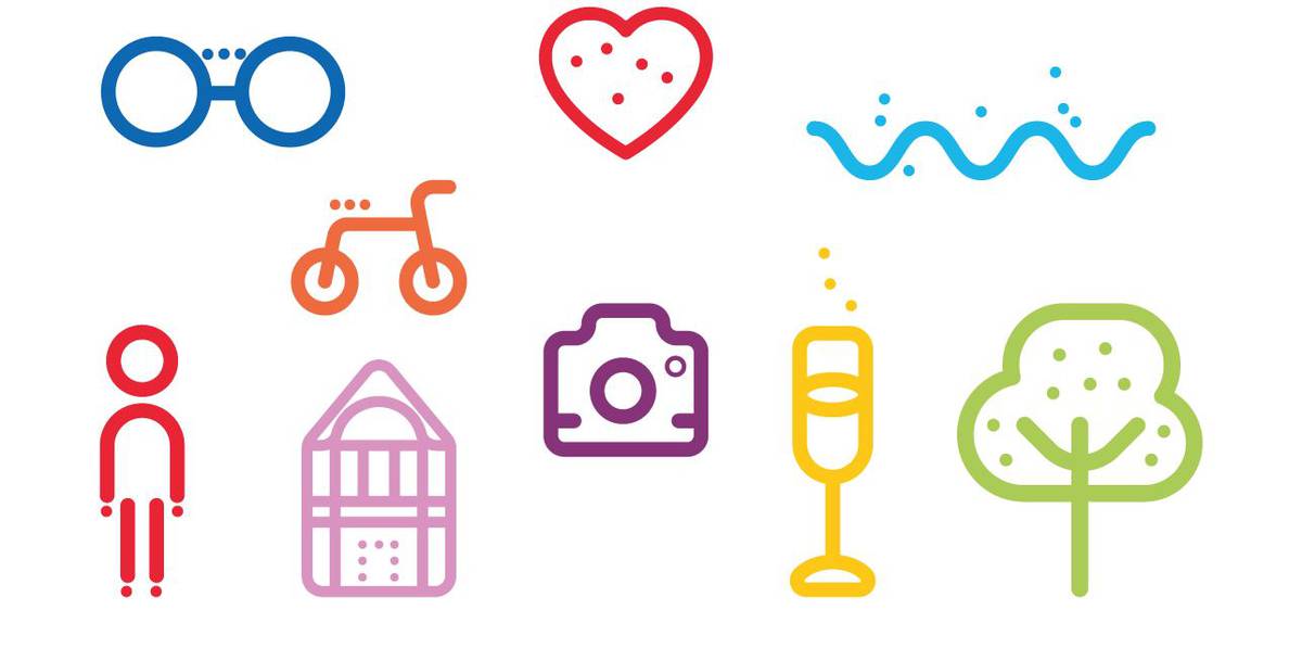
The brand’s identity is expressed through its strong values representative of the region and proudly espoused by its inhabitants: hospitality, authenticity and conviviality. The brand’s identity is expressed via a logo, a colour palette, a typography and icons
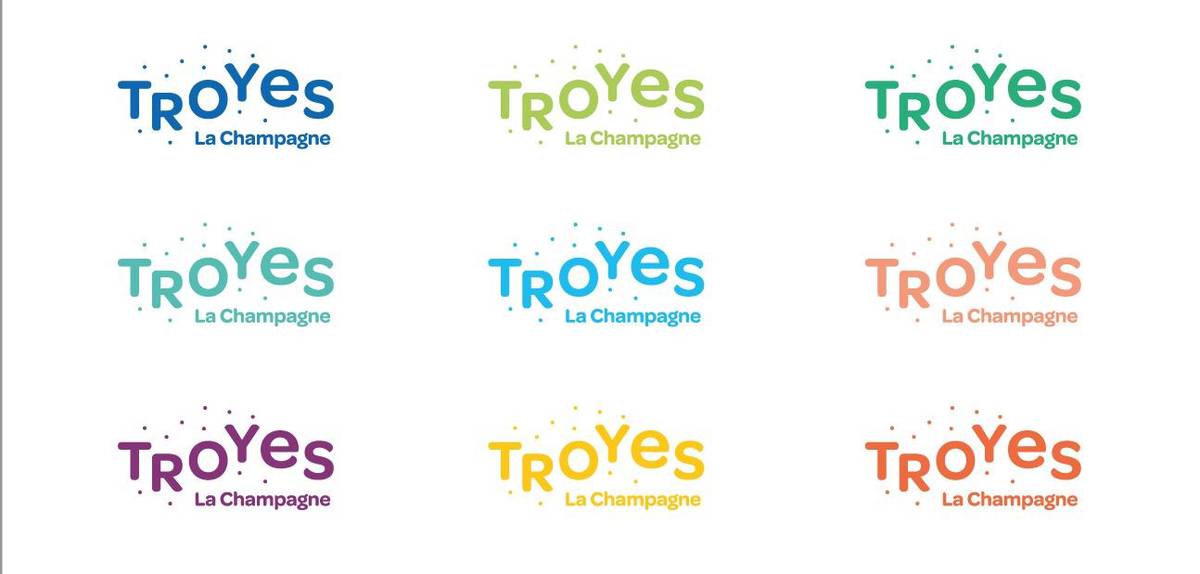
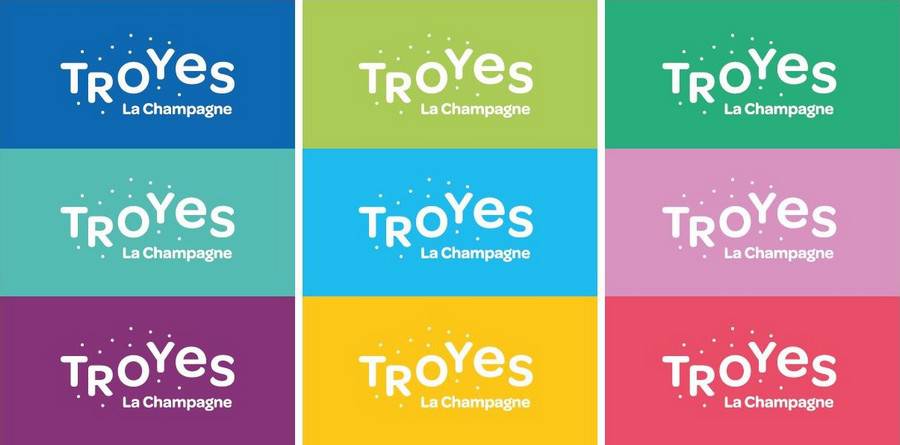
The default colour for the logotype is blue. This colour evokes the colour of the city’s Crest.
3 identifying signs :
- Dots reminiscent of champagne bubbles, sparkling, the idea of a route
- A typography in motion to convey gaiety, dynamism, etc.
- Using capital letters to write TROYeS, with the exception of the lower-case ‘e’, to give a sense of rhythm.
A shared brand
Troyes La Champagne is both a shared brand and a strategic campaign launched in order to reveal “our” Champagne: convivial, hospitable and cheerful.
It is shared because it belongs to all of us and can thus be used by any of us: restaurateurs, shop-owners, hosts and anyone wanting to form part of the campaign and promote the destination.
The brand and the campaigns that accompany it were designed to allow everyone to contribute in their own way to the promotion and development of our region as a tourist destination.
Aims
In a situation where competition is becoming ever-increasingly fierce, the tourism promotion brand aims to bring players from tourism, the economy and culture, in addition to local residents. It is the flag planted by our desire to work together to develop our region, its reputation and its image.
It allows us to benefit in return from a positive image, in order to promote the state of mind of our destination and our tourism offer.
We value your opinion
Looking for information ? An opinion ? A comment ? Troyes La Champagne
+33 (0)3 25 73 22 15 / +33(0)3 25 72 37 78
troyeslachampagne@troyes-cm.fr